Manage dashboard setup
Create and publish dashboard templates, choose the information each one uses and maintain the stages people move through.
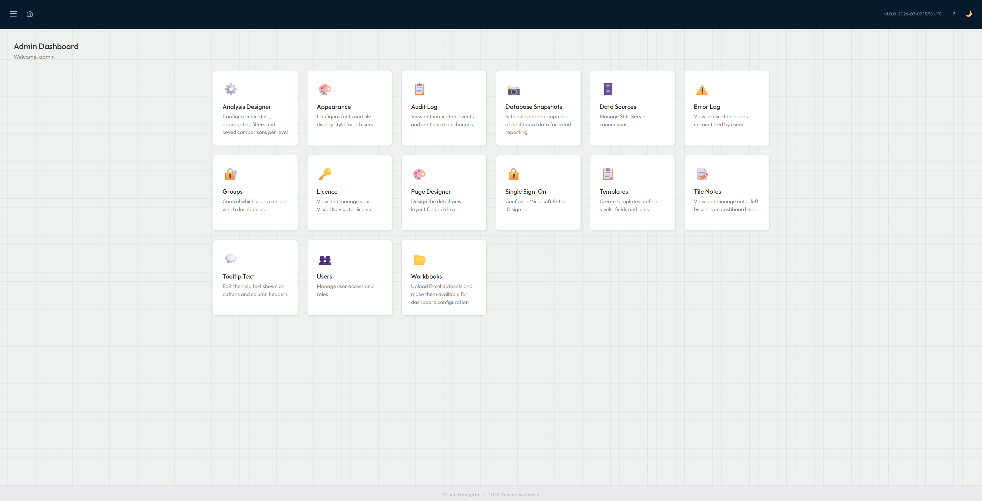
Administration
Look after users, groups, dashboards, database sources, Excel loads, snapshot schedules, appearance and licensing from one administration area.
Single sign-on, the audit trail and the error log are explained separately on the Security page.
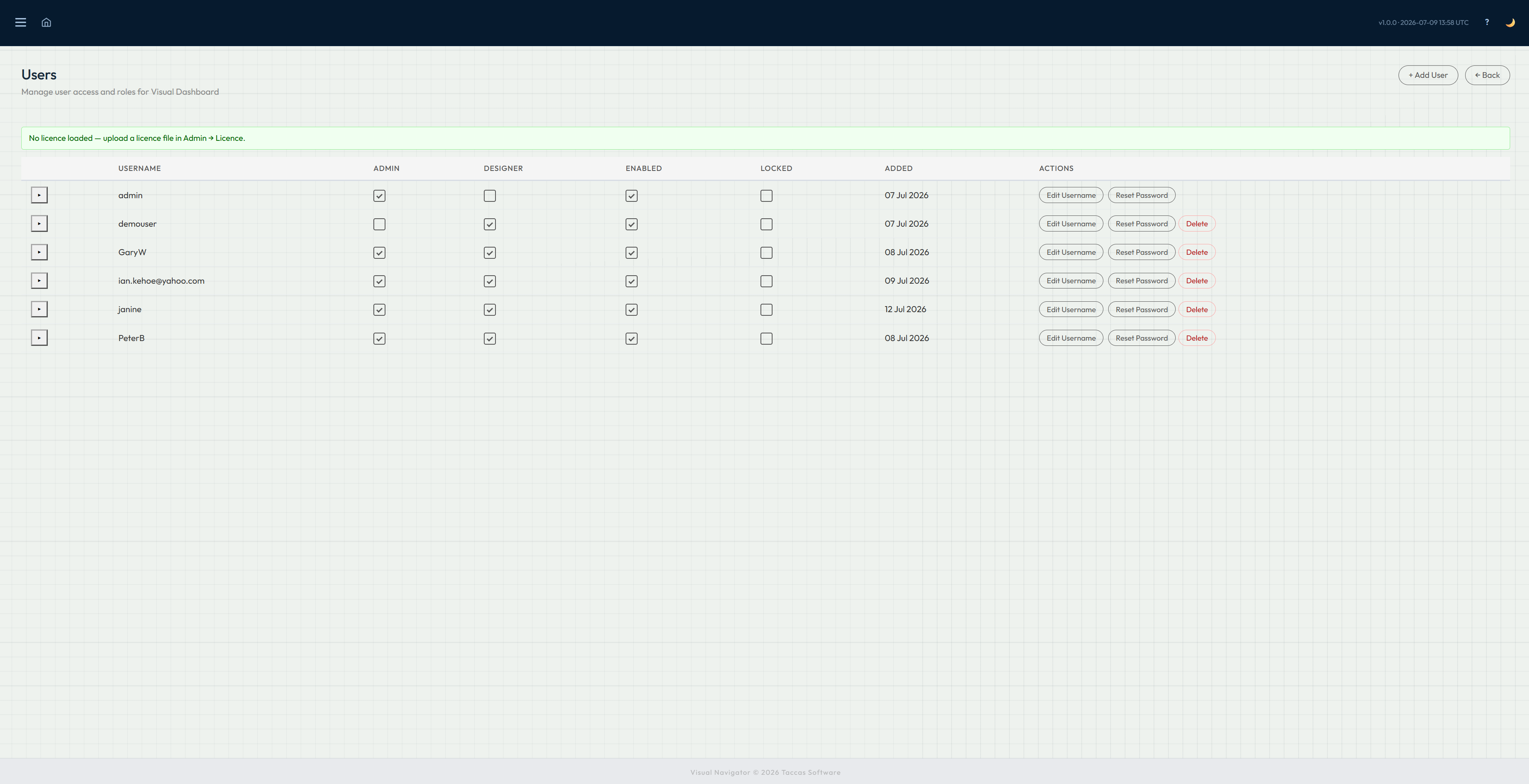
Users
Create and maintain local user accounts, reset passwords and make accounts active or inactive.
Responsibilities can be assigned directly. Administrator access allows trusted people to manage Navi, while Designer access allows selected people to shape dashboards.
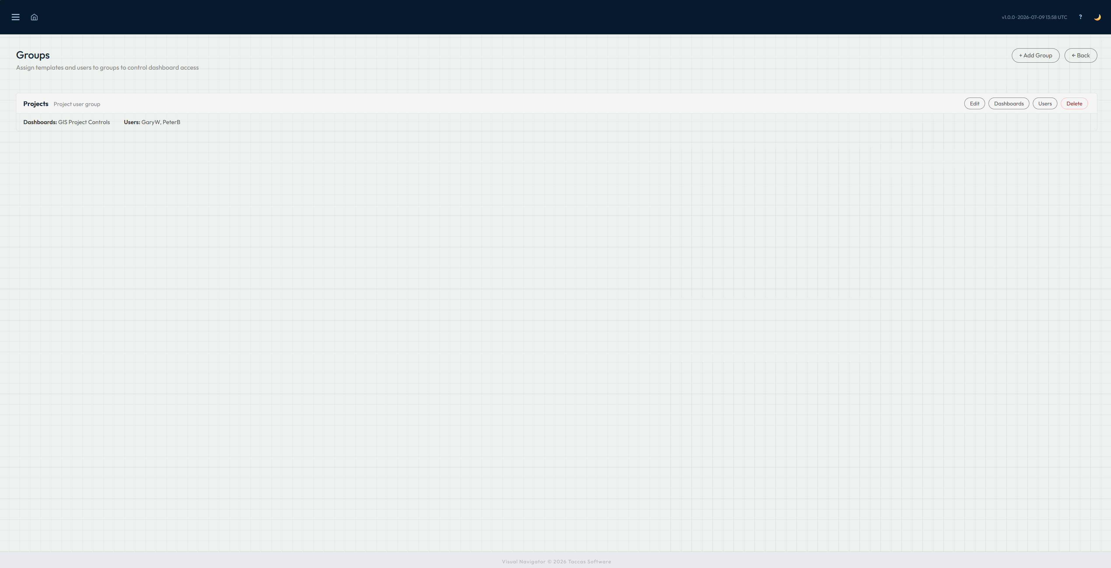
Groups
Create a group for a team or area of responsibility, then assign both users and dashboards to it. Members see the dashboards made available to their groups.
When somebody joins, leaves or changes responsibility, update the group membership rather than changing each dashboard separately.
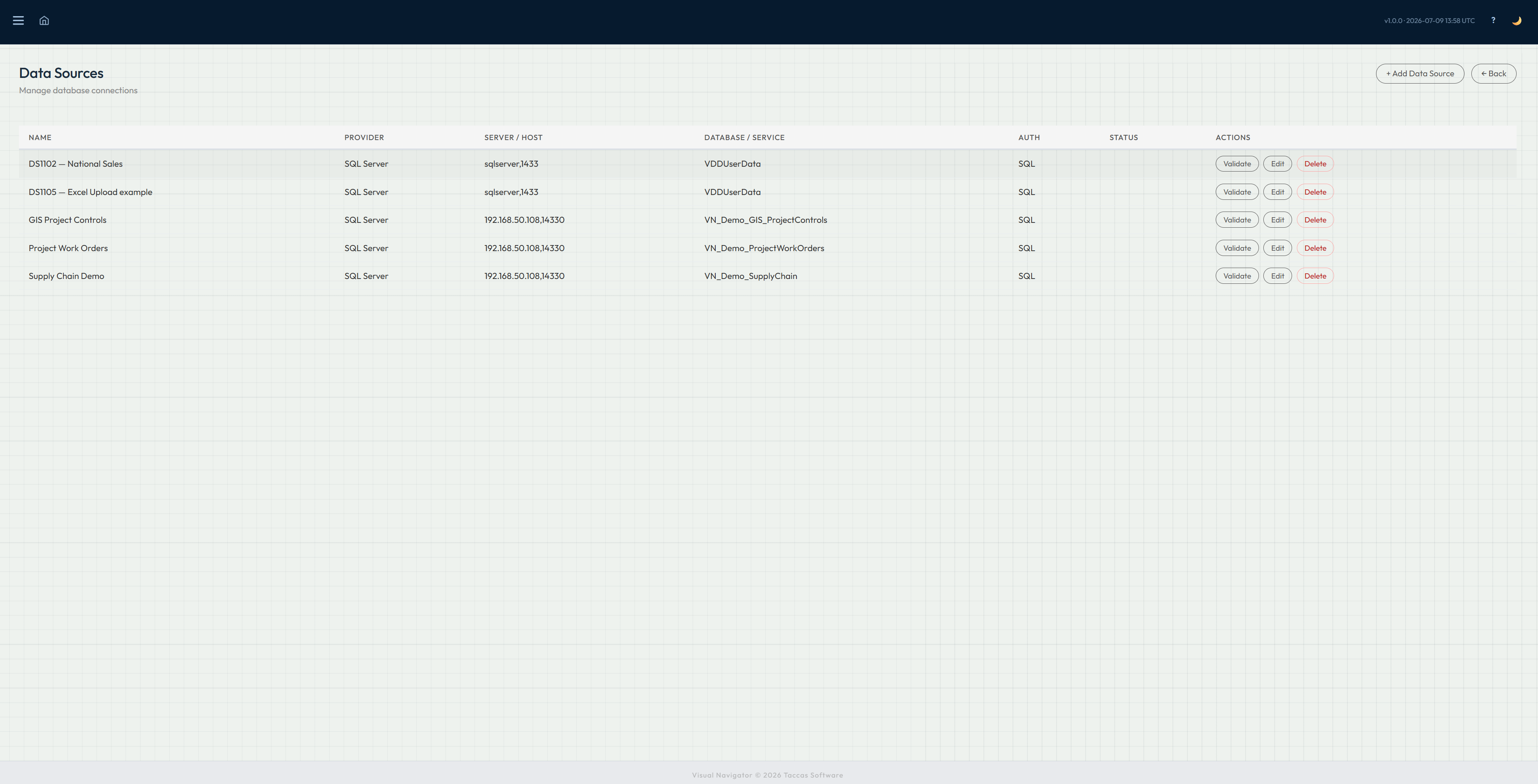
Database sources
Add a source for SQL Server, Oracle or PostgreSQL and give it a name administrators will recognise. Enter the server and database details required for that source.
Use connection validation to check that Navi can reach the database before the source is used by a dashboard. Existing sources can be reviewed and updated from the same administration screen.
Create and publish dashboard templates, choose the information each one uses and maintain the stages people move through.
Look after database sources, Excel workbook loads and the schedules that keep selected database values over time.
Choose appearance defaults, maintain the licence and edit the on-screen help shown inside Navi.